The Complexity Cliff
Imagine a user excitedly downloading your groundbreaking app, only to be met with a bewildering array of options, jargon, and intricate processes. Data shows that apps which immediately bombard users with complexity face significantly lower retention rates. In fact, less than 25% of mobile app users return to an app after their first use if the initial experience is overwhelming. Gradual introduction of features and concepts, known as progressive disclosure, is key to keeping users engaged and turning them into loyal fans. Let’s explore how to master this art.
Common Pitfalls:
- Information Overload: Presenting too much information upfront.
- Lack of Context: Failing to provide adequate context or explanations for features and functionalities.
- Poor Onboarding: Inadequate onboarding experiences that do not guide users through the essential steps.
- Jargon and Technical Language: Using technical terms without proper definitions or explanations.
Solutions:
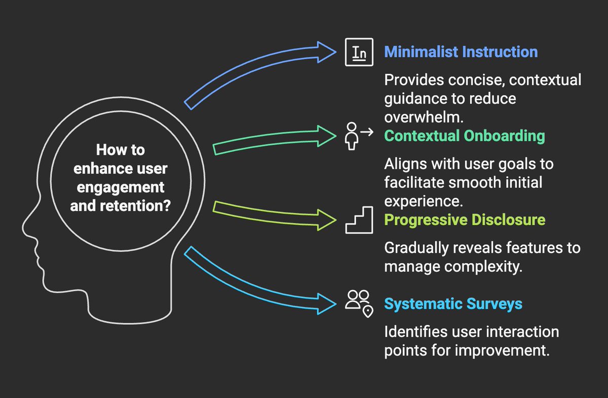
- Minimalist Instruction: Implement minimalist instruction techniques, which focus on providing concise, contextual guidance. Design prompts that allow users to infer missing details through interaction and context.
- Contextual Onboarding: Focus on situated user goals during the initial app session. Identify key tasks and features to onboard, and use design patterns that support these goals.
- Progressive Disclosure: Gradually reveal features and information as users progress. This approach helps manage complexity and prevents users from feeling overwhelmed.
- Systematic Surveys of Contact Points: Conduct surveys of contact points to understand where users meet and exchange content.
The Science of Progressive Complexity
Progressive disclosure aligns with established principles of learning psychology. By managing the complexity presented to users, apps can optimize user engagement and knowledge retention.
Key Principles:
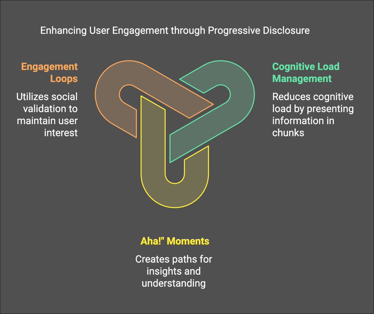
- Cognitive Load Management: Progressive disclosure reduces cognitive load by presenting information in manageable chunks. This approach ensures that users can process and retain information more effectively.
- “Aha!” Moments: Create natural discovery paths that lead users to experience “aha!” moments. These moments of insight and understanding reinforce learning and encourage continued engagement.
- Engagement Loops: Use elements like likes, comments, and views to tap into the human need for social validation, creating feedback loops that keep users coming back for more.
Applying Learning Psychology:
- Chunking: Break down complex tasks into smaller, more digestible steps.
- Scaffolding: Provide temporary support and guidance that is gradually removed as users become more proficient.
- Feedback and Reinforcement: Offer immediate feedback and positive reinforcement to encourage desired behaviors.
Examples of Perfect vs. Terrible Learning Curves
The learning curve represents the rate at which users acquire proficiency with an application. A well-designed learning curve gradually increases in complexity, while a poorly designed one overwhelms users from the start.
Perfect Learning Curves:
- Duolingo: Introduces new language concepts gradually, with ample opportunities for practice and reinforcement.
- Robinhood: Starts with basic stock trading features and gradually introduces more advanced options like options trading and cryptocurrency.
Terrible Learning Curves:
- A crypto exchange that throws all the trading pairs, charting tools, and order types at a new user at once: This creates immediate paralysis and a high likelihood of abandonment.
- An AI-powered design tool that presents all possible filters and customization options without a guided introduction: This can overwhelm users and prevent them from exploring the tool’s capabilities.
How to Identify What Features to Show When
Identifying the right features to reveal at each stage of the user journey requires a combination of data analysis, user feedback, and intuition.
Methods:
- User Journey Mapping: Map out the ideal user journey and identify key decision points and potential pain points.
- Data Analytics: Track user behavior to identify which features are most frequently used and which ones are causing friction.
- User Feedback: Collect feedback through surveys, interviews, and user testing to understand user needs and preferences.
- A/B Testing: Experiment with different feature rollouts to determine which approach yields the best results.
Connecting Learning Psychology to Feature Rollout
To connect learning psychology to feature rollouts, consider the following:
- Progressive Complexity: Gradually introduce more complex features as users demonstrate proficiency with basic functionalities.
- Contextual Learning: Provide on-demand tutorials and tooltips that explain features in the context of their use.
- Personalization: Tailor the feature rollout to individual user needs and preferences based on their behavior and feedback.
How to Create Natural Discovery Paths
Natural discovery paths guide users toward new features and functionalities in a seamless and intuitive way.
Strategies:
- Tooltips and Hints: Use tooltips and hints to highlight new features and suggest relevant actions.
- Contextual Prompts: Display prompts that encourage users to explore related features based on their current activity.
- Gamification: Incorporate gamification elements like badges and rewards to incentivize exploration and discovery.
Builder Exercise: Feature Sequencing Template
Feature Sequencing Template:
- List all the features of your app.
- Identify the core features that are essential for new users.
- Determine the logical sequence in which users will need to learn and use the features.
- Create a rollout plan that gradually introduces new features over time.
- Develop contextual help and tutorials to support users as they learn each new feature.
Complexity Audit Worksheet:
- Identify areas in your app where users might feel overwhelmed or confused.
- Assess the cognitive load associated with each task or feature.
- Simplify the interface and reduce the number of options presented to the user.
- Break down complex tasks into smaller, more manageable steps.
- Provide clear and concise instructions and feedback.
Here’s your TL;DR: Your app isn’t complex because it needs to be. It’s complex because you’re allergic to making decisions for your users. Remember: Confusion is death, and death is not protocol growth.
Watch your back (and your retention metrics). Don’t die.
Trips over unread user feedback surveys on way out
P.S. If you’re building something at Starknet and this post hurt your feelings, good. Now go fix your UX. Love you. 🫡

Leave a comment